aes·thet·ics
esˈTHediks/
noun
These are the underlying things that make art interesting, appealing, and wonderful. The real trick is to achieve them all at the same time. 😉
People have been studying how to make things look good for a long, long time… For example, ancient civilizations figured out the Golden Ratio — that we STILL use — to make things look good…
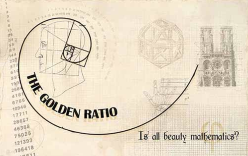
More pics of the Golden Section
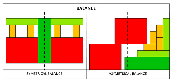
Balance
Most art is balanced because the result is appealing. There are two kinds of balance:
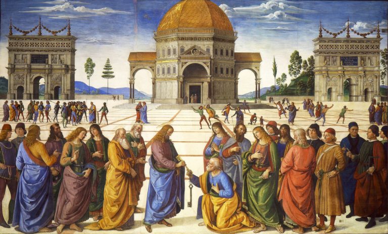
- symmetrical … You could draw a line down the middle of the art and it matches on both sides. Symmetrical balance conveys a very formal feeling or possibly a very harmonious feeling of perfection. It was used in religious art in the past.
- asymmetrical … Balanced using other visual tricks. Asymmetrically balanced art has more variety, visual interest, and liveliness.
Symmetrically Balanced Examples…
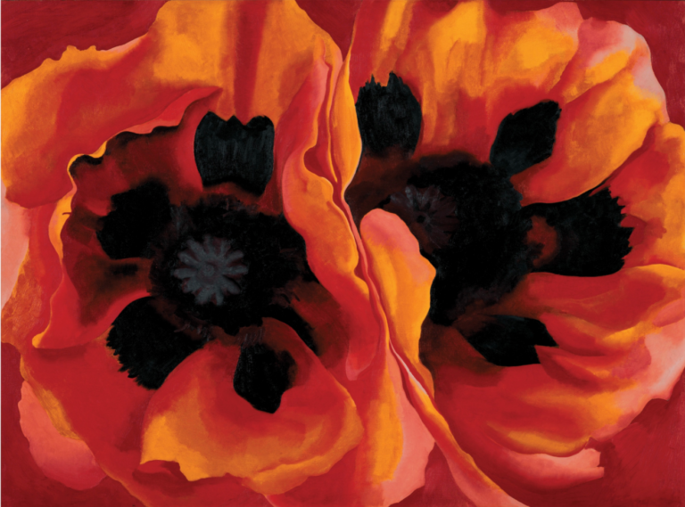
Oriental Poppies by Georgia O’Keefe
Achieving Asymmetrical Balance
Most art is asymmetrically balanced and there are a number of things to consider when trying to achieve balance.
Which has more visual weight?…
- a large form is heavier than a smaller form
- dark values are heavier than light values
- a textured form is heavier than a smooth form
- a complex form is heavier than a simple form
How do you balance asymmetrically?…
- two or more smaller forms balance one large form
- a smaller darker form balances a larger lighter form
- objects toward the edge or corner of the composition appear heavier
- intense colors are heavier than muted colors
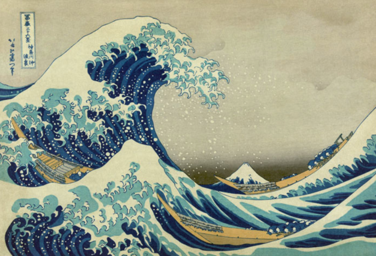
Asymmetrically Balanced Examples…
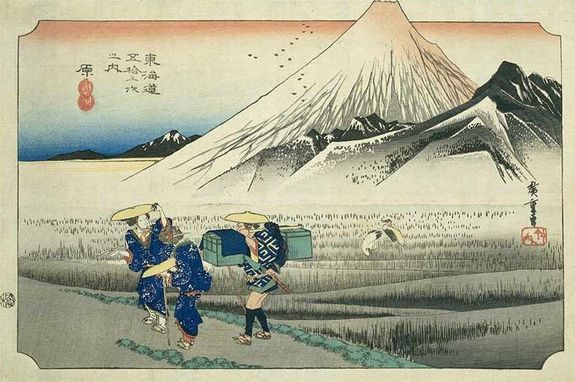
Hiroshige View of Mount Fuji from Harajuku, part of the Fifty-three Stations of the Tōkaidō series ukiyo (“floating world”) print, referring to an evanescent world, impermanence, and fleeting beauty
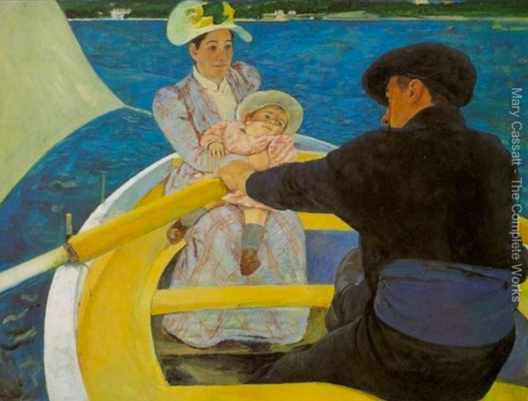
By Mary Cassatt
Some art will be unbalanced purposely to create an off-kilter, unpleasant effect. However, in most cases, if something if off-balance, it’s a mistake.
Here’s a great article about how Balance works and why designers and artists need to understand it: https://www.smashingmagazine.com/2015/06/design-principles-compositional-balance-symmetry-asymmetry/
Contrast
Contrast is simply defined as difference. Difference between art elements like color, value, size, texture, and so on can intensify the image creating a more powerful result through contrast.
A viewer’s eye usually goes to areas with the most contrast. Therefore, if you want to make someone see something, the greatest point of contrast should be at that point. Conversely, if you don’t want to distract a viewer’s eye towards an area, tone down the contrast in that area. (How can you tone down contrast in some areas of a shot or image?)
Contrast can add interest to your image. Or it can be too overpowering/off-putting and can cause viewers to want to go elsewhere. Remember that you need to subordinate some things in order to allow other things to take center stage — that’s called subordination.
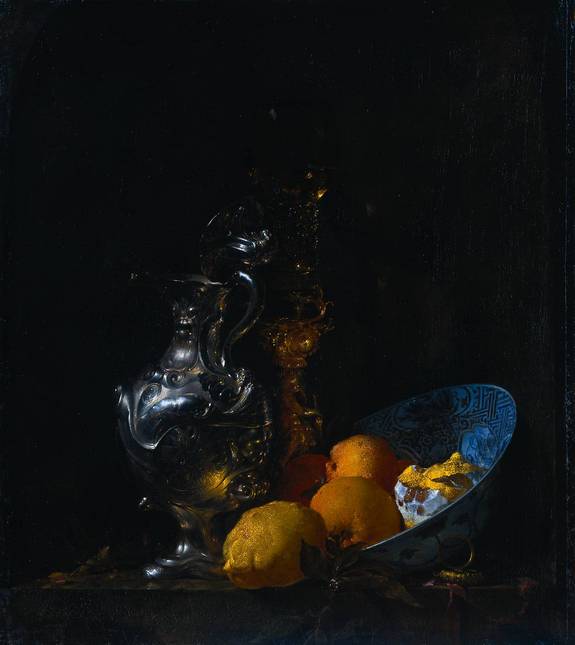
Willem Kalf Life with Silver Jug c. 1655-57
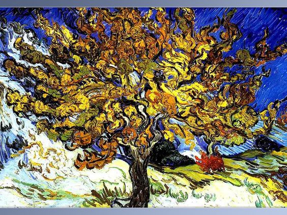
By Van Gogh
Emphasis
Several techniques can be used to create emphasis in art — and emphasis is often used to create a focal point or a “center of interest” in the work. Again, you need to make some things subordinate (less noticeable) so that you can place the focus on your focal point. (What is the Center of Interest in the paintings below? How did the artist achieve that?)
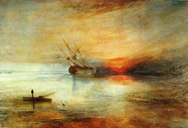
Fort Vimieux by William Turner, 1831
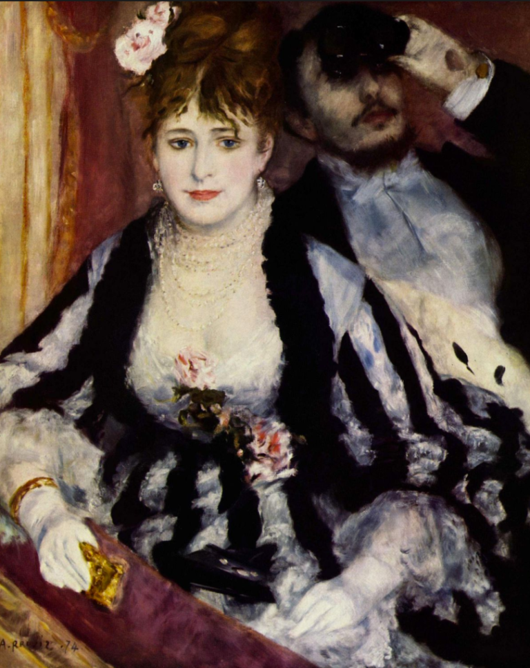
La Loge by Renoir
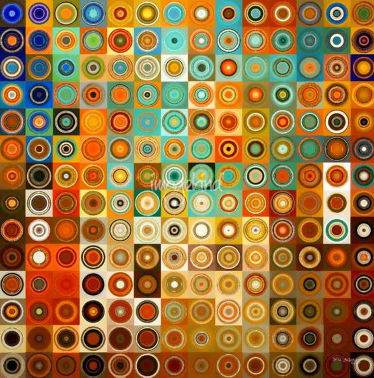
Pattern
Pattern is an underlying structure that organizes surfaces or structures in a consistent, regular manner. Pattern can be described as a repeating unit of shape or form, but it can also be thought of as the “skeleton” that organizes the parts of a composition.
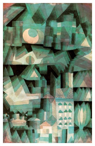
PAUL KLEE (1879-1940)
Dream City, 1921 (watercolor and oil)
Pattern without Hierarchy
When pattern is distributed consistently and without any attempt to subordinate anything, you get a decorative effect without a center of interest like the painting below… Your eye doesn’t go to a focal point, rather, it sees the pattern and your mind doesn’t tend to seek meaning, although it may appreciate the beauty of the colors, etc. Pure pattern can create a decorative effect.
Unity
A principle of art, unity occurs when all of the elements of a piece combine to make a balanced, harmonious, complete whole. Unity is another of those hard-to-describe art terms, but, when it’s present, your eye and brain are pleased to see it.
Unity is based on the gestalt theory of visual perception, which states that the eye of the viewer seeks a gestalt or unified whole. This means that the viewer is actually looking for a connection between the elements, for some sort of organization, for unity in the design.
A gestalt is created because the mind simplifies and organizes information. It does this by grouping elements together to create new wholes. Understanding how the mind groups elements (by proximity, similarity, continuation and alignment) helps us understand how unity can be achieved.
What creates a unified image?…
- Proximity is based on grouping by closeness; the closer elements are to each other, the more likely we will see them as a group. Proximity is one of the easiest ways to achieve unity.
- Repetition is based on grouping by similarity; elements that are similar visually are perceived to be related. Any element can be repeated – line, shape, color, value or texture – as well other things such as direction, angle or size. Repetition helps unify a design by creating similar elements and is one of the most effective ways to unify a design.
- Alignment consists of arranging elements so that their edges are lined up. The common alignment allows the eye to group those elements together. A grid is often used to create unity through alignment, not just in a single design but also between related designs (the pages of a magazine or book, for example).
- Continuation means that something (a line, an edge, a curve, a direction) continues from one element to another. The viewer’s eye will follow the continuing line or edge smoothly from one element to other and the mind will group the elements because of this connection. Implied lines are one example of continuation.
Movement
Movement is how the viewer’s eye moves through an image. Placement of the objects will lead and guide a viewer’s eye. Dynamic compositions are aesthetically more successful than static compositions. So, determining the best placement for subjects within your composition is very important.
Here are some tips to know:
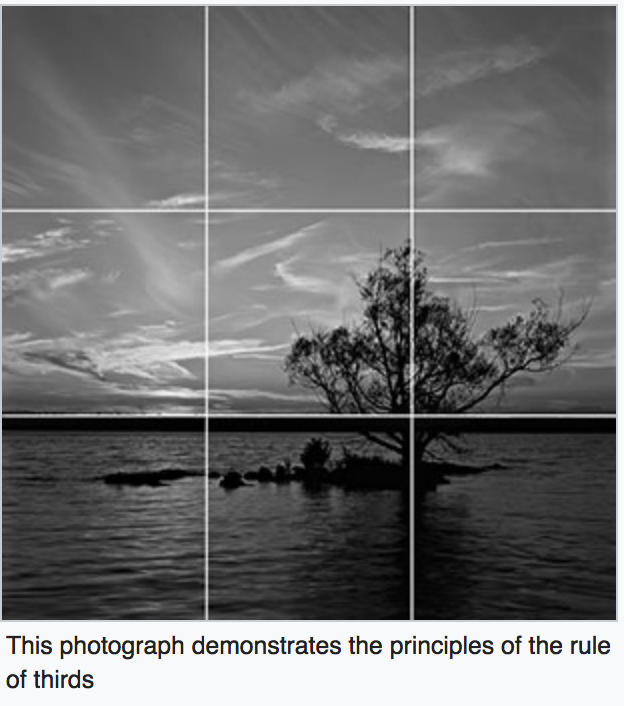
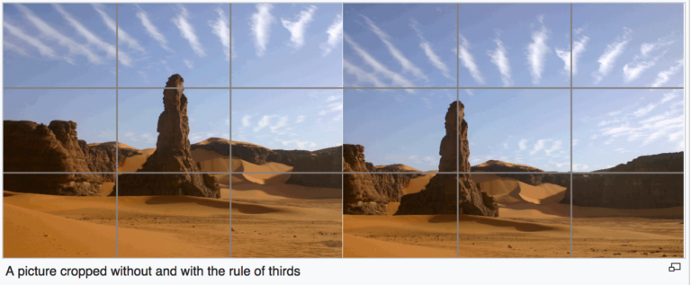
- People tend to “read” an image from left to right. Often, it’s a good idea to place the “center of interest” in the Golden Section on the right-hand side of the frame/canvas… This is also called the Golden Ratio and is similar to the Rule of Thirds. Basically, since ancient times, people have been using math to prove that using these proportions creates the most pleasing compositions and architecture. For us, let’s just use it as a guideline for setting up our camera shots and composing other art.
Examples of Rule of Thirds…

- The brain is wired to recognizes faces and will move our gaze to faces, particularly the eyes of the people in the image. We automatically move our eyes in the direction we see someone else looking. (It’s most likely a survival mechanism and it occurs in all people. Infants as young as three months old will follow the eye gaze of those around them.) If you want someone to look in a specific direction in your design, you can place a human face looking in that direction.
- The eye notices areas of high contrast first.
- The eye travels across areas following the lines and shapes that are connected through the image. Shapes that are similar in darkness/lightness tend to be grouped together into larger shapes, whereas areas where a light meets a dark will draw attention and stop the eye.
- The eye will stop at areas that block the flow through the image, like areas of high contrast or a focal point such as a figure.
- You can also create movement through perspective, which draws the eye into the depth of field of the composition. The viewer deduces the depth in pictures based on how things appear in the visual world. Larger objects appear closer (and more important). Cooler colors appear further away.
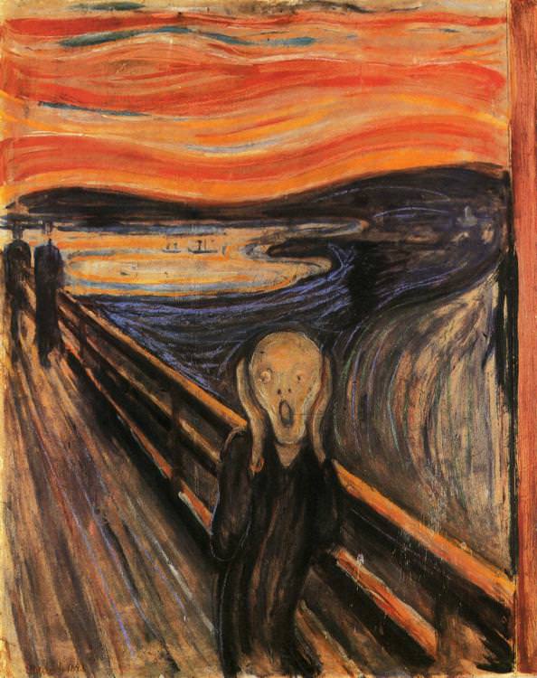
The Scream by Edvard Munch
Woodblock print by Hokusai
Rhythm
Repetition refers to one object or shape repeated; pattern is a combination of elements or shapes repeated in a recurring and regular arrangement; rhythm–is a combination of elements repeated, but with variations.
Whenever movements begin to flow in a repeatable pattern, they become something more—they turn into rhythm.
Rhythm can be found in the choreography of a dance, in the painting of an artist, and of course, in songs and melodies.
In looking at music, we see all sorts of styles. Some styles are slow and mellow (like a waltz) others are quick and lively (like a tango). The one thing that all rhythms have in common, however, is repetition. Rhythms must repeat themselves.
In painting, rhythm can be created with the repetition of strokes, visual elements/motifs, or even entire subjects.
In the painting below, the rhythm is achieved by repeating round shapes and curves.
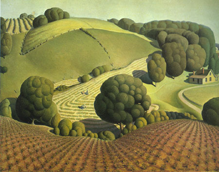
Grant Wood “Young Corn” 1931
In the painting below, the rhythm is achieved through repetition of strokes, lines, and shapes.
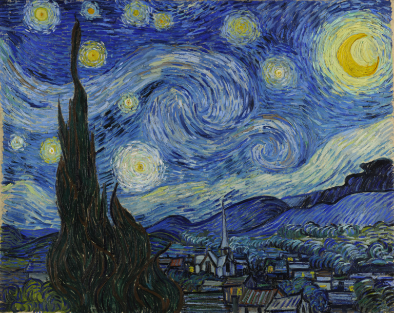
Starry Night by Van Gogh
Elements of Art
The elements (pieces) of art are the building blocks of art that can be used to carry out the principles that all of above explains ^^.
Here are the elements:
- Line
- Shape
- Color
- Value
- Texture
- Space
- Form
Color!
Of all of the art elements, the one that requires the most study to grasp is COLOR! Here are some articles to get you going:
- https://99designs.com/blog/tips/the-7-step-guide-to-understanding-color-theory/
- https://designschool.canva.com/blog/website-color-schemes/
Color Schemes…
And Adobe has a tool that helps you to pick out a color scheme for a project here:
Leading the Eye
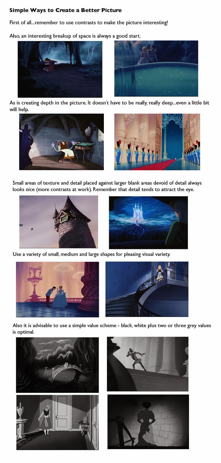
Mark Kennedy explores here some samples from classic Disney films, illustration, comics, and storyboards to describe some tips on staging and layout.
Group Analysis
The following link will take you to the options for your group to analyze…
Examples of Art Principles in Animation Film Stills (for group analysis)
Citations…
http://vanseodesign.com/web-design/direct-the-eye/
https://www.sophia.org/tutorials/design-in-art-balance-and-contrast
http://artcuratorforkids.com/artworks-that-show-balance/
https://www.smashingmagazine.com/2015/06/design-principles-compositional-balance-symmetry-asymmetry/